An Artist's Hack: Two ideas, one style?


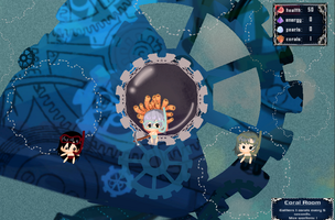
As one of the two artists on the team, my role was to make the game look good and feel visually consistent! I had a lot of fun working with everyone and really enjoyed this! Many first times, drawing a steampunk whale and animating humans!
It was also my first jam working with another artist which was fun and challenging!
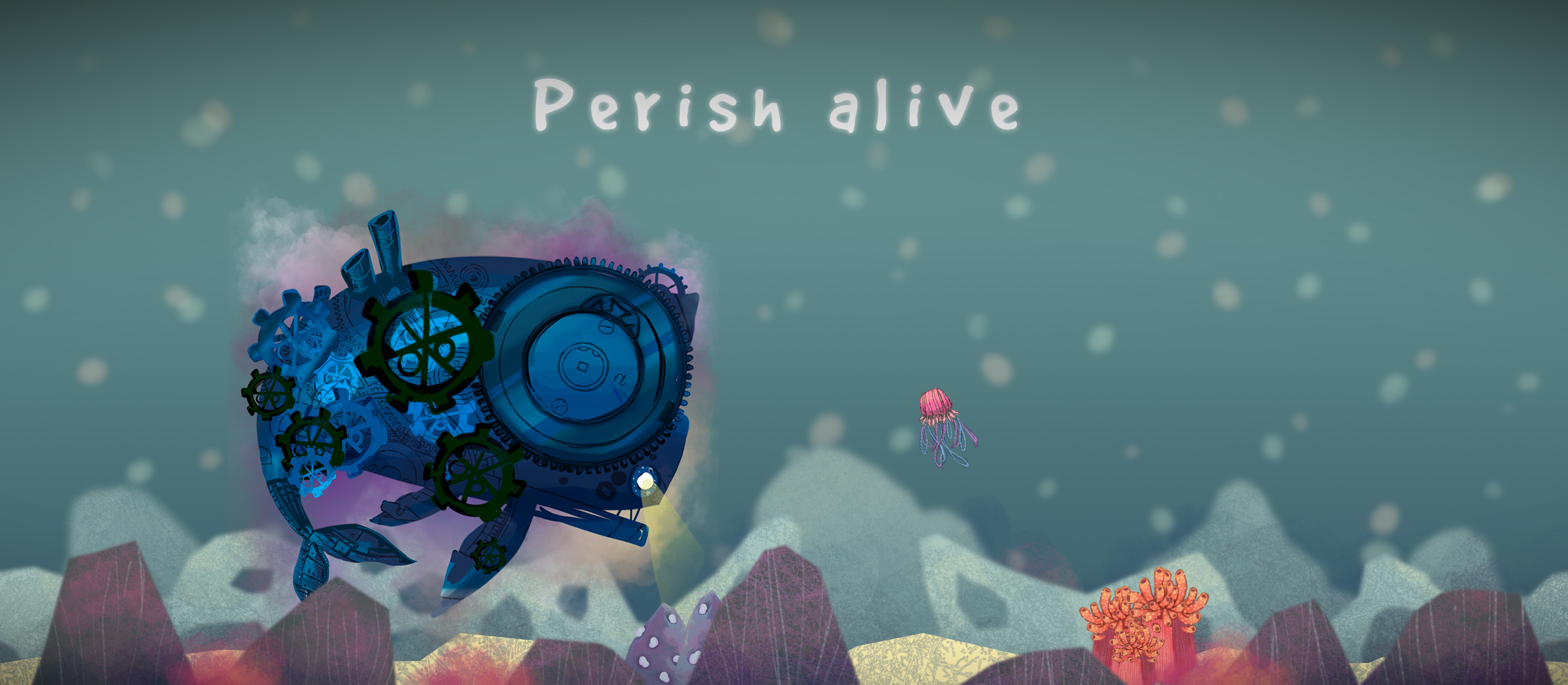
Our biggest challenge was the 2 of us artists had very different ideas and styles! While she wanted cute pastel reef, I imagined a dark and dangerous deep sea. At first, I was going to do a cute whale to match Trixii's style. But Trixii encouraged me to share my opposing idea. From there, it was magic!
The solution? Do both! Instead of trying to change our styles, we decided to use the contrast to our advantage. This sparked the whole narrative of a dangerous Steampunk Whale polluting a beautiful serene ocean. I would draw player objects (whale, crew) in a dark and dangerous mood, while she would do the environment (background, enemies) as sweet and cute.
What really helped the process was constantly sending each other work-in-progress sketches, and being encouraging :D aka we chat a lot. hahaha!
Here's the research I did as I designed the whale: I used the color palette Trixii came up with as a background to ensure visual consistency :)
------
This is more like a note to self xD If I ever wana put this on my portfolio lolol
My responsibilities:
- Art and animations for whale, humans, and rooms.
- UI graphic design
- Scripted procedural generation for graphics
- Procedural animation for the gears
- Procedural character creation for humans
- FX
- Pollution cloud
- Room generation FX
- Bubble FX
- Design
- Gradually revealing the whale
- Layout of rooms
- Progression & Economy design (related article: A Designer's Tricks: Why Those Numbers?

Perish alive
One whale's success is another's failure
| Status | Released |
| Authors | Lyrcaxis, Haiyoooo | Artist, virimine |
| Genre | Strategy |
| Tags | 2D, Atmospheric, Ludum Dare 46, Management, Real time strategy, underwater, whale |
More posts
- A Designer's Tricks: Why those Numbers?Apr 24, 2020

Comments
Log in with itch.io to leave a comment.
You were quite in sync, no conflicts in the artstyle and everything fit together well.
Thanks!!!! :)))) Gona show off your comment to Trixii too haha, she'll be so happy too